.png)
Orange County Museum of Art
Responsive Web Redesign
INTRODUCTION
How might we improve website usability to ensure OCMA maintains a competitive edge?
My Role
Interaction Design
User Research
Prototyping
Timeline
1 month
Tools Used
Figma
Miro
Team Members
2 other UX Designers
Orange County Museum of Art (OCMA) is a modern and contemporary art museum located in Santa Ana, Orange County, California. Being avid museum visitors, my teammates and I realized that the OCMA website design lacked accessibility compared to its competitors. We challenged ourselves to improve information architecture and maintain branding to ensure the website has a competitive edge.
Note: This is a team concept project and I am not affiliated with the Orange County Museum of Art. We created this case study to improve the user experience of our local museum's website that we enjoy visiting.
PROBLEM
Stella, our art student persona, faces these pain points when visiting the OCMA website:
Missing information on current exhibitions
Stella visits museums to study current exhibitions for an art research paper. Not finding current dates on the website is discouraging to visit the museum.
Navigation dead ends
Stella is unable to navigate to other pages on the website easily. She has to click the back button on internal pages to land on the home page and then navigate to other pages.
Lack of accessibity for finding visit information
Stella is unable to find visitor information, hours of operation, and the location of the museum. It's a hassle to search for this information outside of the website. OCMA not having a visit page makes it highly inconvenient for the user to find all the information needed to visit the museum.

SOLUTION
Accessible and minimalistic website redesign
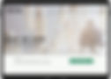
Introducing visit page
Stella can find visitor information, hours of operation, and the location of the museum. It's highly convenient to find all the information while navigating the museum website.
The original OCMA website did not have a visit page.

AFTER
Detailed exhibitions page
Stella can find current exhibitions on display along with the dates which assist in planning a visit to the museum and learning about the exhibiition for her art research paper.

BEFORE

AFTER
Reconstructing information architecture
Stella is able to easily locate the information she needs such as visit information, exhibitions, events, job opportunities. The detailed visit page, exhibitions page, and revamped information architecture provide her with better assessability, reducing the website abandonment rate.

BEFORE
AFTER
RESEARCH
Understanding user needs and pain points
User Surveys
Why do users visit museum websites? We surveyed 27 participants to learn about who our target users are and what they looked for when browsing museum websites.
96%
of users are millennials between the ages of 21 to 35
90%
of users visit museum website to learn about visitor information (hours of operation, ticket price, location)
30%
of users abandon the website because of inability to find the visit and exhibitions information
User Interviews
After learning about our target users, we conducted 5 user interviews through zoom video call. We asked the users to share their video and screen and browse the current OCMA website. We discovered that users had difficulty navigating between pages, finding information about current exhibitions and had frustrations with inaccessible text.
“Can not find information about tickets and current exhibitions. Would not visit the museum since I did not find the information I needed in order to plan my trip to the museum”
“The important information text is extremely tiny and not easy to read. There’s no back button on a few pages which is frustrating”
Heuristic Evaluation
The interview participants evaluated the user interface of the website which helped us pinpoint usability issues.

Competitive Analysis
To understand how to improve the interaction for the OCMA website, we looked into competitors websites that are located in the same geographical area, Orange County. We looked at two direct competitors - UCI Institute and Museum of California Art (IMCA) and The Museum of Contemporary Art (MoCA) which are art museums similar to OCMA. We also looked at indirect competitors - Aquarium of Pacific and OC Discovery Cube which are tourist locations in Orange County.
We studied the advantages and drawbacks of each of their websites in order to brainstorm functionalities for the OCMA website. Some of the strengths included accessibility and readability of the important information on their websites and consistency of the design style. Some of the drawbacks included important information hidden in internal pages and most of the pages overwhelmed with text.


Key Research Takeaways

Users abandon the website when they don't find the information they wanted

Visitor and current exhibitions information are most important for the user

Website lacks accessibility and efficiency as it has navigation dead ends, lack of information, and inconsistent links

Website holds significant information about artists, exhibitions that could be beneficial to the users but is overlooked because of inaccessibility
User Persona
Based on research we discovered pain points and frustrations of the users and created our user persona. Consider Stella is a 23-year-old art student looking to explore museums for both educational and enjoyment purposes.
.jpg)
INFORMATION ARCHITECTURE
Redefining website structure
Site Map
To address the user's pain point of inability to locate important content on the website we aimed to restructure the content on the website. We referenced results from the card sorting activity to identify content patterns, group alike items together, and label new categories. By identifying key topics why users visit the website and creating tertiary navigation, we were able to build a site map that was more structured and comprehensive.

WIREFRAMES
Creating mid-fidelity prototypes for usability testing
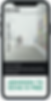
Desktop

Mobile

USABILITY TESTING
Accessibility is Key
We conducted moderated usability tests with 5 users to determine any design flaws or accessibility issues with the information architecture. We listed out tasks and acceptance criteria to determine the task completion rate.
Tasks
1. Checkout the exhibitions now on view
2. Find detailed info on Carolina Caycedo’s exhibit
3. Find out how much Admission is and the museum’s address
The task completion rate was 100%, but we found a few design issues
User Feedback
“Events and images on the homepage lack detail. I would like to know a little more information about the events before clicking on it”
“The arrows are confusing to operate on the exhibitions page. Not sure when the exhibitions are on display”
ITERATIONS
We iterated mid-fidelity designs after considering user feedback from usability testing.
Homepage


INITIAL DESIGN
Lack of detail for the images on the homepage
NEW DESIGN
Added descriptions to the images and highlighted current exhibitions as hero images.
Exhibitions Page

INITIAL DESIGN
Users were confused about the arrows and wanted to see the dates of the exhibitions
NEW DESIGN
Eliminated the arrows and included ‘now on view’ and ‘past exhibitions’ toggle button on the same page for easy acces. Added the dates.

PROTOTYPING
Designing and Collaborating
Based on the usability testing and information architecture we collaborated and brainstromed some ideas for design system that resinated with the OCMA museum's brand identity
Design System

High Fidelity Mockups

HOMEPAGE

VISIT

EXHIBITIONS PAGE


IMPACT AND TAKEAWAYS
Business Impact
Since this project was only conceptual, we could not measure actual success metrics data. However, we hypothesis that our project would measure these metrics for the Orange County Museum of Art:
Number of Visitors to the Museum
To increase the number of users who successfully gather visitor information from the website and visit the museum

Abandonment Rate
To decrease the number of visitors to the website who abandon the website before finding the information they need

Number of events attendees
To increase the number of attendees who successfully learn about events on the website and attend the events at the museum.

Challenges
-
We wanted to converse with OCMA stakeholders and conduct an interview to understand their business goals. We were unable to get a hold of them so we had to understand their brand through the content posted on the website.
-
We were stuck on different designs concepts that each of us wanted to implement. We utilized A-B testing with our users to finalize which design we should go forward with.
-
Since the website had a lot of content, it was challenging for us to organize the content in a concise manner on the main pages.
Takeaways
-
Usability testing is an excellent way to validate design decisions and helps to improve future interactions.
-
Reducing the number of clicks by reconstructing the information architecture engages the user to the website and reduced the abandonment rate during usability testing.
-
User's museum visit experience starts before they step foot in the museums. The museum's website really sets the tone of their experience.
